
Coding Crafts - Corporate Website Design
Coding Crafts
Business & Growth
Web & UI/UX
Design & Branding
Creative Process & Workflow
[OVERVIEW]
This project focused on redesigning a modern SaaS platform aimed at improving user engagement, simplifying navigation, and creating a more conversion-focused digital experience. The platform offered digital services and solutions but struggled with an outdated interface, weak visual hierarchy, and unclear user flows that reduced overall usability and engagement.
The goal was to create a scalable, modern, and intuitive experience that aligned business objectives with user needs while improving accessibility, clarity, and interaction across the platform.


PROCESS
Problem
Despite offering valuable services, the platform faced several UX and interface challenges that impacted engagement and usability.
Key Challenges
Outdated visual design and inconsistent UI patterns
Complex navigation structure with poor content hierarchy
High bounce rates and low user retention
Unclear CTAs and weak conversion pathways
Lack of scalable design consistency across pages
Mobile responsiveness and accessibility limitations
The existing experience created friction throughout the user journey, making it difficult for users to navigate services efficiently or understand the platform’s value proposition.
Research & Discovery
The discovery phase focused on identifying usability gaps, understanding behavioral patterns, and evaluating the effectiveness of the existing interface structure.
Discovery & Audit
Conducted usability and interface audits across key pages
Reviewed navigation structures and conversion pathways
Analyzed engagement patterns and interaction flow issues
Evaluated visual hierarchy and readability consistency
UX Findings
Users struggled to navigate between services efficiently
Important content lacked prioritization and visibility
Interfaces felt visually outdated and difficult to scan
The overall experience lacked a clear and structured flow
These findings helped establish the foundation for restructuring the platform experience and improving usability across the product.
UX Strategy & Solution
The redesign strategy focused on simplifying the experience while introducing a scalable and modern interface system.
UX Strategy
Simplified navigation architecture for improved usability
Reorganized content structure and service hierarchy
Introduced clearer user journeys and conversion paths
Improved readability and interaction consistency
Optimized layouts for responsive behavior across devices
Solution
The final solution introduced a cleaner and more intuitive SaaS experience through modern layouts, structured spacing systems, scalable UI patterns, and stronger visual consistency.
The platform was redesigned to guide users naturally through the experience while reducing complexity and improving accessibility.
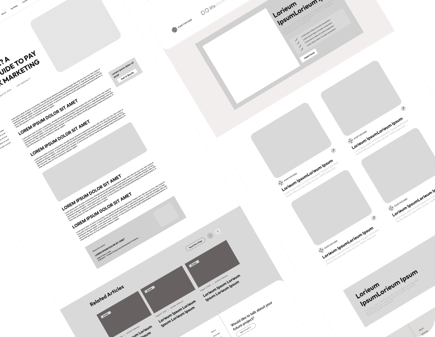
Wireframes & UX Exploration
Low-fidelity wireframes and layout explorations were created to test content structure, navigation behavior, and interface hierarchy before moving into visual design.
Focus Areas
Information architecture
User flow optimization
Content prioritization
Section hierarchy
Responsive layout behavior
The wireframing process helped validate layout decisions early and streamline the overall user experience.
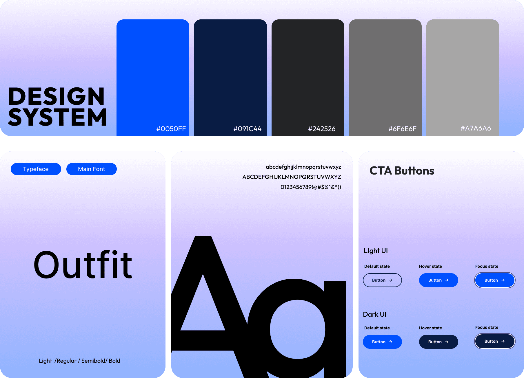
Design System
A scalable design system was developed to create visual consistency across the platform and support future scalability.
Design System Elements
Structured spacing and grid system
Modern typography hierarchy
Scalable UI components and cards
Consistent button and interaction states
Unified color palette and accessibility-focused contrast
The system ensured consistency across pages while improving readability and interface clarity.
High-Fidelity UI Design
The visual direction focused on creating a modern, minimal, and conversion-focused interface aligned with the platform’s digital positioning.
UI Improvements
Cleaner layouts and structured content blocks
Modern dashboard-inspired visual language
Improved CTA visibility and interaction clarity
Enhanced responsiveness across devices
Refined typography and spacing consistency
The interface balanced aesthetics with usability to create a more engaging and scalable digital experience.
Prototype & Interaction
Interactive prototypes were developed to refine navigation flows, transitions, and interaction behavior before final delivery.
Included
Interactive navigation flows
Hover and focus interaction states
Responsive interaction testing
Smooth transition behavior
CTA interaction refinement
This phase helped validate the usability and responsiveness of the final experience.

RESULT
The redesigned platform delivered a significantly more structured and user-friendly experience focused on clarity, usability, and engagement.
Outcome
Improved visual consistency and scalability
Simplified user journeys and navigation flow
Reduced interface complexity and friction
Enhanced responsiveness and accessibility
Stronger engagement through clearer interaction patterns
The final product successfully transformed the platform into a modern SaaS experience with a scalable foundation for future growth.

