
Orion — SaaS Analytics & Order Management Dashboard
Orion® Inc.
Business & Growth
Web & UI/UX
Design & Branding
[OVERVIEW]
Orion is a modern SaaS dashboard concept designed to help businesses monitor analytics, manage orders, track customer activity, and oversee operational performance from a single platform.
The project focused on creating a scalable dashboard experience that transforms complex business data into clear, actionable insights. By combining analytics, order management, reporting, and customer operations within a unified interface, the platform enables teams to make faster decisions and improve workflow efficiency.


PROCESS
Type
B2B SaaS Dashboard
Process
Discovery & Product Research
User Flow Mapping
Information Architecture
Dashboard Planning
Design System Creation
Wireframing
High-Fidelity UI Design
Interactive Prototyping
Problem
Modern business platforms often struggle with information overload, making it difficult for teams to quickly understand performance metrics, manage orders, and monitor operational activity.
Key Challenges
Large amounts of data competing for attention
Inconsistent dashboard layouts across modules
Poor visibility of key business metrics
Complex order management workflows
Limited scalability for future platform growth
Difficulty balancing analytics with usability
The goal was to design a dashboard that could present complex information clearly while maintaining speed, accessibility, and ease of use.
Research & Discovery
The discovery phase focused on understanding how businesses interact with operational dashboards and identifying opportunities to improve efficiency.
Research Areas
SaaS dashboard patterns
Order management workflows
Analytics visualization techniques
Data hierarchy and prioritization
User navigation behavior
Key Findings
Users need immediate visibility of critical metrics.
Information should be grouped based on business goals.
Visual hierarchy plays a major role in decision-making.
Simplified navigation improves task completion speed.
Consistent UI systems reduce learning curves.
These insights guided the overall dashboard structure and interaction strategy.
UX Strategy & Solution
The UX strategy focused on reducing complexity while increasing clarity across all dashboard modules.
UX Strategy
Create a clear information hierarchy
Surface key metrics above the fold
Simplify order management workflows
Improve data visualization readability
Design scalable navigation patterns
Support quick decision-making through visual cues
Solution
The final solution introduced a modular dashboard system combining analytics, reporting, customer management, and order tracking into a cohesive experience.
The interface was designed to minimize cognitive load while helping users quickly access the information most relevant to their daily tasks.
Wireframes & UX Exploration
Before visual design, low-fidelity wireframes were created to validate dashboard structure and content hierarchy.
Focus Areas
Navigation architecture
Dashboard widget placement
Order management flows
Analytics visualization
Responsive behavior
The wireframing phase helped establish a scalable foundation before moving into detailed UI design.
Design System
A scalable dark-theme design system was created to support long-term product growth and maintain consistency across modules.
Typography
Primary Font
DM Sans
Used for:
Headings
Navigation
Body Content
Dashboard Data
Secondary Font
Space Mono
Used for:
Revenue Metrics
Data Visualization
KPI Values
Order IDs
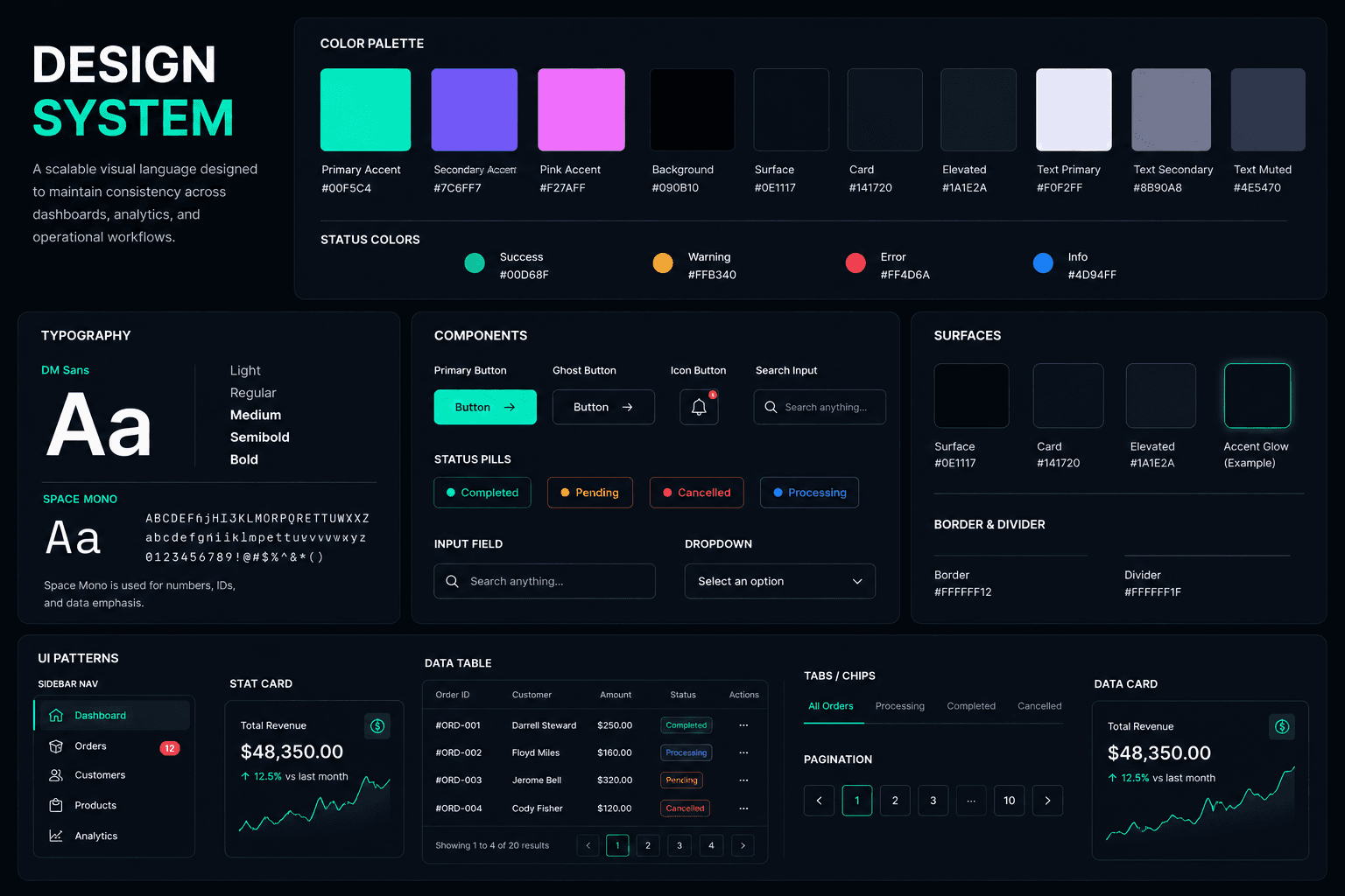
Components
Metric Cards
Data Tables
Analytics Charts
Status Pills
Progress Indicators
Navigation Components
Dashboard Widgets
Form Controls
Modal Systems
The design system ensured consistency while enabling rapid expansion of future dashboard modules.
High-Fidelity UI Design
The visual direction combines enterprise-grade functionality with a modern SaaS aesthetic.
UI Improvements
Modular card-based dashboard layouts
High-contrast dark interface
Clear KPI prioritization
Improved readability across data-heavy screens
Consistent spacing and visual hierarchy
Modern analytics-focused visual language
The final UI balances usability and aesthetics while maintaining focus on business productivity.
Prototype & Interaction
Interactive prototypes were developed to validate workflows and refine user interactions.
Included
Dashboard navigation flows
Order management interactions
Status updates and filters
Search and sorting behavior
Modal and drawer interactions
Responsive dashboard testing
This phase ensured that users could move efficiently between tasks while maintaining context throughout the platform.
The final dashboard delivers a scalable SaaS experience that improves visibility, organization, and operational efficiency.
Outcomes
Improved visibility of business KPIs
Simplified order management workflows
Faster access to actionable insights
Reduced information overload
Enhanced scalability for future features
Consistent and modern user experience
The project successfully transformed complex operational data into a clean, intuitive, and highly scalable SaaS dashboard designed for modern business teams.

